User-Friendly UX vs Attractive UI
Thursday 18th December, 2025

In web design, one debate never seems to end:
Should a website focus on being visually attractive or user-friendly?
Many designers instinctively choose aesthetics — hero images, modern layouts, animations, and perfectly balanced sections. But real data often tells a different story.
I conducted a real-world experiment by creating two nearly identical websites with similar content, services, and goals.
The only significant difference between them was the UX/UI structure, particularly how the hero section and contact form were designed and placed.
Website Version One: Conversion-Focused UX With a Simple UI
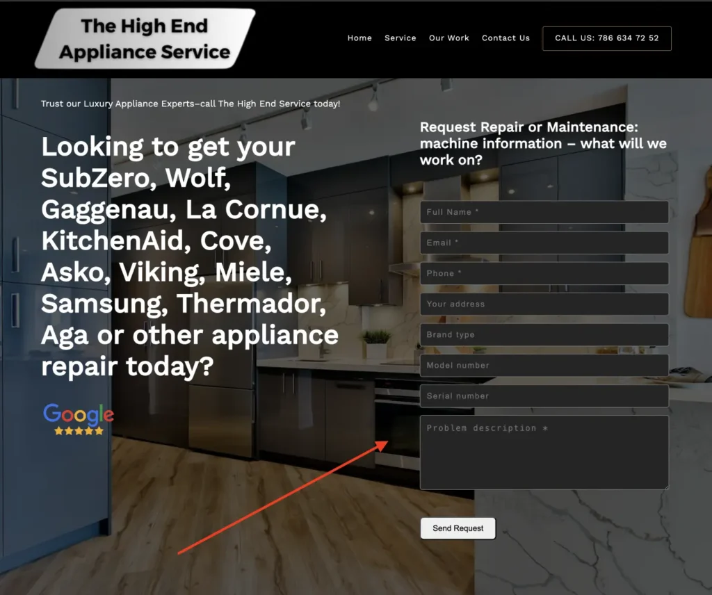
The first website used a highly practical, user-friendly layout:
- No traditional hero image
- Contact form placed directly in the hero section, aligned on the right
- A single cover background image used consistently across all sections
- Users could submit a request immediately, without scrolling
This version was not the most visually attractive, but it removed friction and made taking action extremely easy.
Website Version Two: Attractive Design With Delayed Action
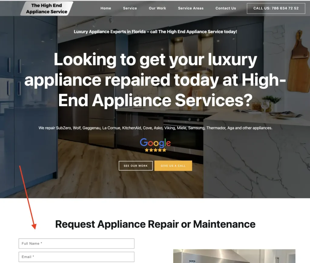
The second website focused more on visual appeal and modern design:
- Large hero section with a full-width background image
- Centered headline, description text, and CTA buttons
- Clean spacing and visually engaging layout
- Contact form placed in the second section, alongside an image
While this version looked more polished and aesthetically pleasing, users had to scroll down before they could contact the business.
Conversion Results After Four Months of Testing
After four months, the difference in performance was clear and measurable:
- The first website generated approximately 70% more contact form submissions
- It also received significantly more scheduled orders and inquiries
- Users acted faster and with less hesitation
This happened despite the fact that the second website looked more modern and attractive.
Why the Less Attractive Website Performed Better
The main reason is simple: convenience beats design.
Most users behave like “lazy users” — not in a negative sense, but in a practical one. They prefer:
- Fewer steps
- Less scrolling
- Immediate access to action
By placing the contact form directly in the hero section, the first website allowed users to act instantly, without thinking or navigating further.
User-Friendly UX vs Attractive UI: A Practical Lesson
This experiment highlights a key difference:
- Attractive UI creates a strong first impression and supports branding
- User-friendly UX removes friction and directly increases conversions
When the primary goal of a website is lead generation or bookings, ease of action matters more than visual storytelling.
Key Takeaway for Conversion-Focused Websites
If your website’s goal is to:
- Generate leads
- Receive contact requests
- Schedule calls or orders
Then your main action (contact form or CTA) should be visible above the fold, without requiring any scrolling.
One extra scroll may seem small, but in this test, it resulted in a 70% difference in conversions.
Posted by Edgar Hovhannisyan